
Vonage
A new vision for the modern consumer
Vonage - one of the world’s leading VOIP providers - had a tendency to get into the weeds with their consumers without fully expressing the value proposition of their service. Consumers would be presented with massive discount offers before they ever had a chance to understand the relevance of the service to them and their lives. As part of a larger pitch strategy to refocus Vonage on an approach that targeted consumers based on their needs vs. granular offers, I put together a team of developers, UXers and visual designers to, in a matter of weeks, flesh out a new vision of how Vonage could reposition it’s primary consumer gateway - it’s website - to better focus on the consumer and how Vonage could fit into their lifestyle.
[Agency: TBWA\Chiat\Day]
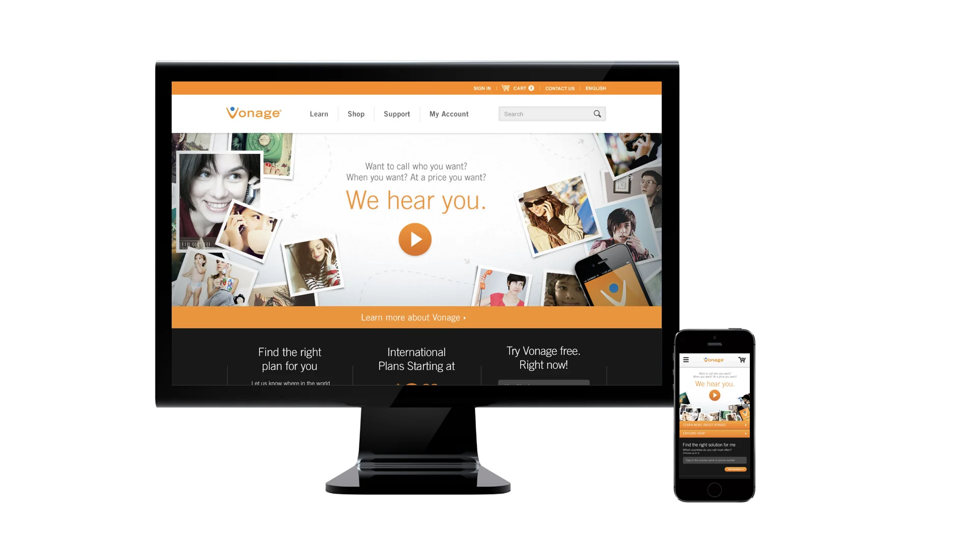
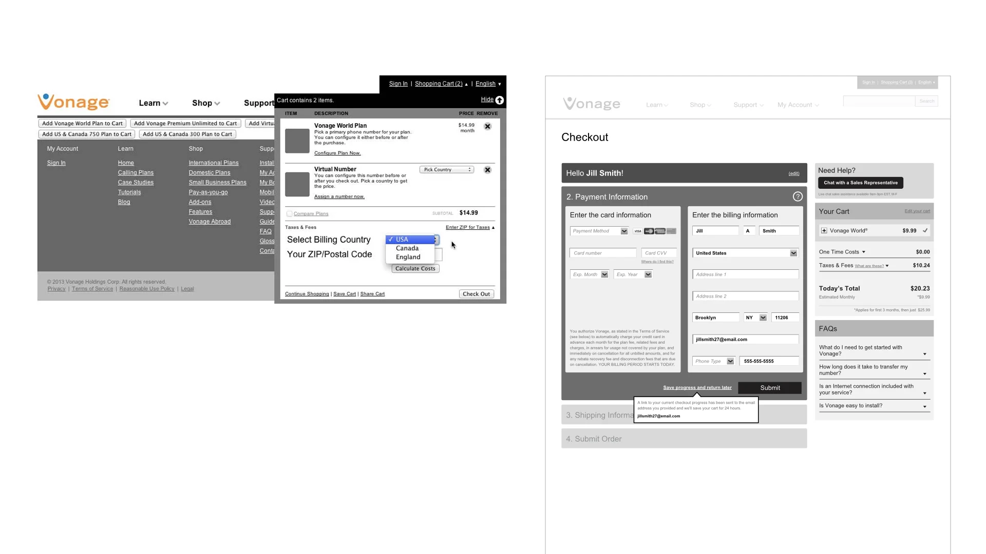
At the time, the Vonage site was very in the weeds with seasonal offers and didn't address the benefits of the service to a segmented user base. New users were overwhelmed before they even understood how the service was relevant to them.
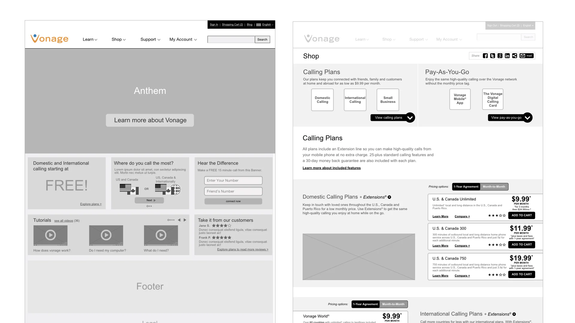
To help map out this vision, I re-architected the site structure to better support a new user journey.
By mapping out the journeys and user flows for different personas, I focused a more segmented experience depending on user's needs and vectors into the sites.
One of the important design principles that I wanted to convey with the prototype was to align to current best practices around audience segmentation, mobile optimization, navigation and shopping cart behavior. For example, at the time the Vonage site was not mobile optimized. As part of this vision, I wanted to demonstrate the importance of a device-agnostic approach, to allow consumers to interact with Vonage on their terms, and where they were (which was more and more on mobile).
One of the most important aspects to convey was the behavioral responsiveness of the site. For example, if the user clicked in for the first time directly into the site, the messages conveyed would be broader and focused on oriented the user on the relevance of the service to them. However, if the user clicked into the site from a banner add, it would deliver on the messaging and/or value proposition in the banner ad.
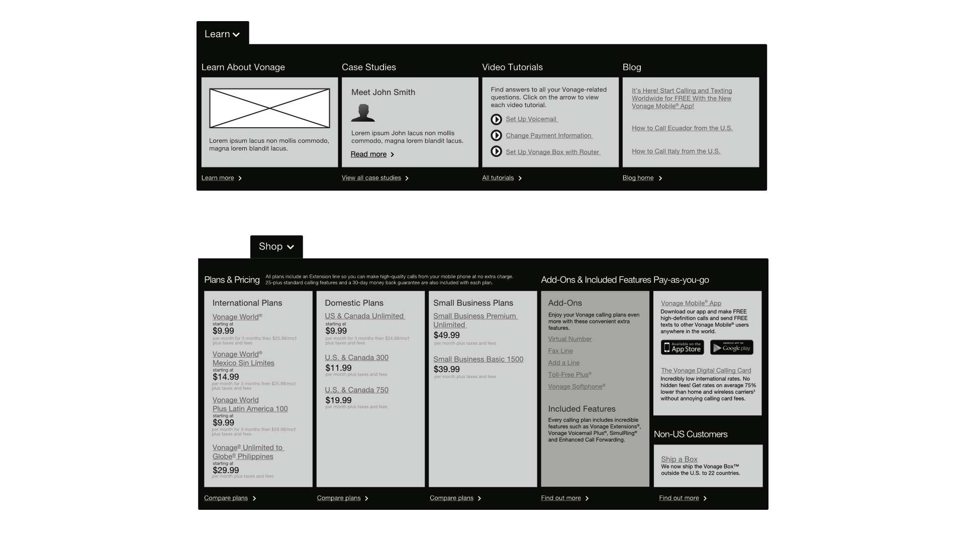
Supporting pages were focused on aligning Vonage to the consumer's lifestyle and to providing a clearer picture of what the actual offerings were.
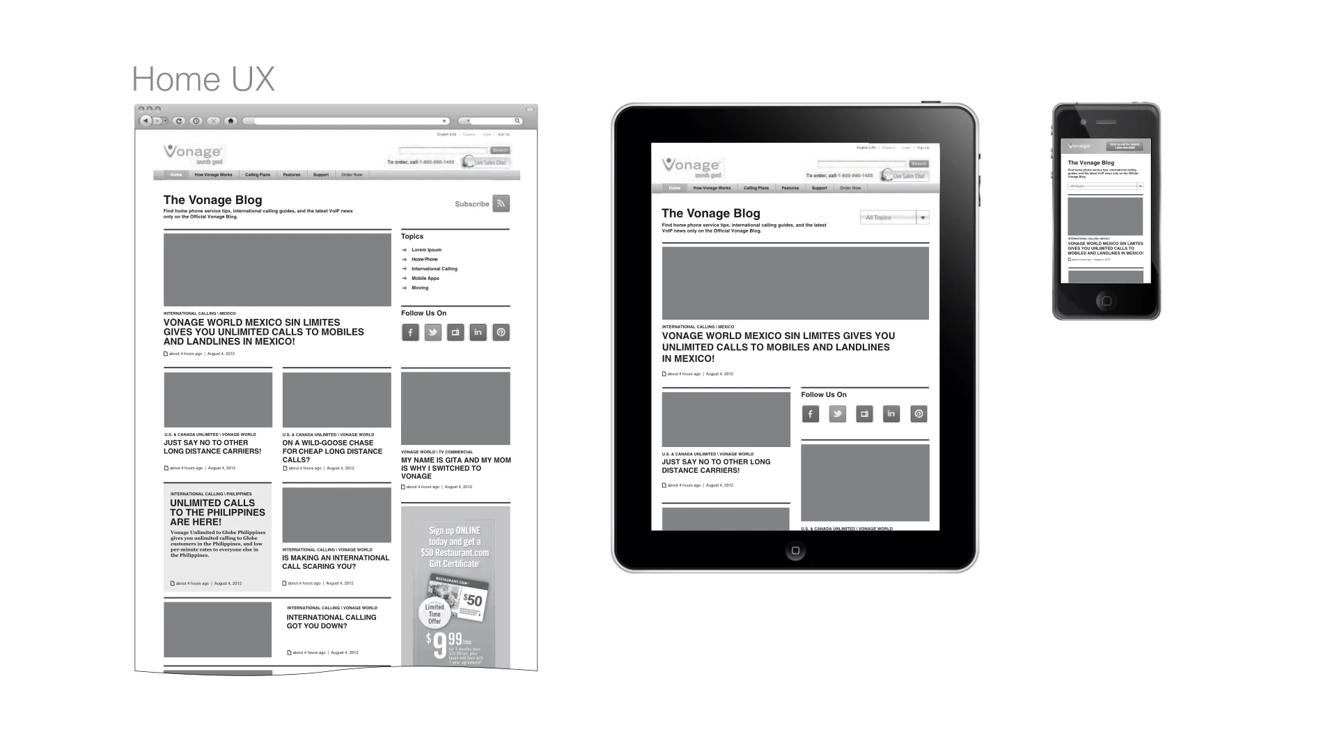
Finally, the whole experience was optimized for mobile.